For MEJO 182: Foundations of Graphic Design
Using Adobe Illustrator and Adobe Photoshop, I designed the promotional material for an online campus organization meeting, campus event, local festival, local band performance, or local film event, focusing on spatial organization and hierarchy, color theory, typography, unification of design, technical execution, and creativity.
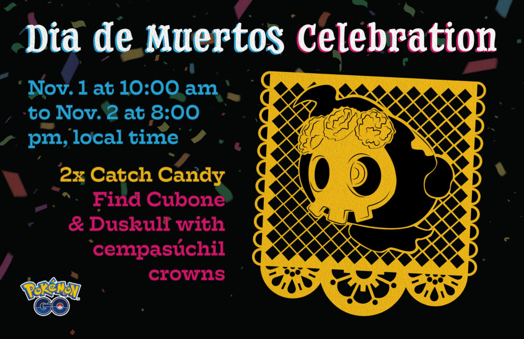
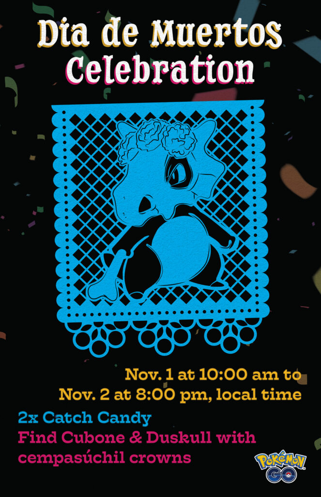
My two final posters:


Promotional Material
The promotional material I decided to design a poster for was Pokémon Go’s Día de Muertos 2023 Celebration. In an article, Pokémon Go described the celebration as being a “joyful celebration full of colors, music, flowers, and flavors.” I decided that “colors” and “flowers” would be a central feature of my design, showcasing the celebratory mood associated with this event.
The event entailed several special features, including new costumed Pokémon appearing during the event, lure modules lasting for an extended 90 minutes, incense lasting for an extended 90 minutes, 2x catch candy, additional candy for transferring Pokémon, and featured avatar items and stickers. These are just a few examples of the event’s activities. I knew that I couldn’t feature all these details on the poster, so I decided to showcase the two features that players would be the most excited for: 2x catch candy and encountering Cubone and Duskull with cempasúchil crowns.
Design
A stable of Mexican occasions is papel picado, a traditional decorative craft made by cutting designs into tissue paper. Typically, the papel picados would be produced in great quantities to be displayed together, creating colorful banners. The Day of the Dead is one such occasion that features papel picados in both the streets and on altars.
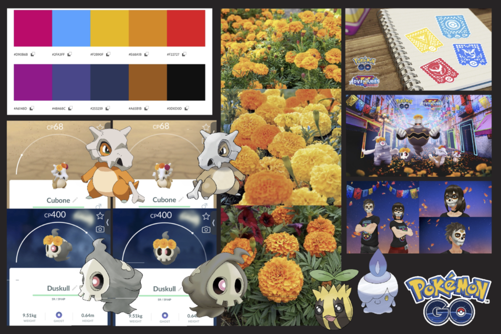
Acoridng to National Geographic, the Day of the Dead is a holiday of joyful celebration rather than mourning, remembering the departed. Keeping this in mind, I wanted to create a bright color scheme with colors taken directly from Pokémon Go’s promotional material on the event through Adobe Colors. The yellow and pink variations emphasize this celebratory mood, representing joy and happiness, respectively. While warm colors are certainly more common in Day of the Dead decorations, I believed that it added a much-needed splash of cool color. Furthermore, the primary colors – red, yellow, and blue – represent the teams in Pokémon Go, grounding the poster in its source material.
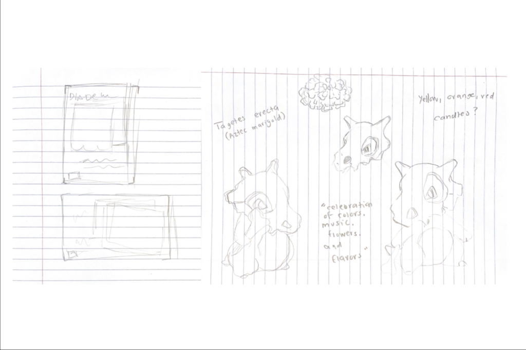
For the central graphic, I decided to illustrate two of the events featured Pokémon – Cubone and Duskull – with their cempasúchil crowns. For the duration of the event, players could encounter these Pokémon in the wild with their featured accessories – a great additional to any player’s collection of Pokémon. The designs took a while to make as I wanted them to be plausible, meaning that the designs could translate into real papel picados.
The posters can stand effectively on their own, but they also complement one another. The change in orientation adds visual intrigue and allows for additional uses on platforms. The hierarchy of text remains the same. However, the coloring of the text differs to complement the main graphic. The papel picados clearly different in their designs – both the featured Pokémon and details of the paper cutouts – but are recognizable as having the same style.
Typefaces
My primary typeface is DryCowboy, an Adobe font. The font has a Western-style with curved and irregular serifs. Looking at the font, I was struck by how the serifs resembled bones. Both Cubone and Duskull feature bones with Cubone’s skull helmet and bone club and Duskull’s skull mask. Bones are a common motif in Day of the Dead Celebrations.
My secondary typeface is Hatch. While also a serif font, Hatch is far more understated than Cowboy, appearing legible but not overpowering the poster’s headings.
Intended Message
These posters are meant to showcase Pokémon Go’s Día de Muertos Celebration, highlighting the unique features and opportunities for players to explore. I wanted a bright color scheme and the addition of confetti, courtesy of Adobe Stock, to highlight the celebratory nature of the event. I thought the papel picado was the perfect was to showcase Cubone and Duskull with their cempasúchil crowns – easily the most visible feature of the event. In a game where “shiny” and “event” Pokémon are highly sought after, players – aware of the event or not – would have noticed these fantastical creatures.
I wanted Pokémon Go players to easily recognize what was going on within seconds of looking at the posters and be excited to participate.