For MEJO 182: Foundations of Graphic Design
Using Adobe Illustrator, I designed the basic element’s of a company’s corporate identity, focusing on spacial organization and hierarchy, color theory, typography, and technical execution of vector symbols.


Logo
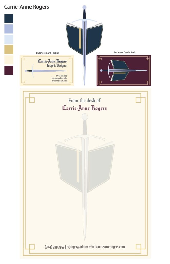
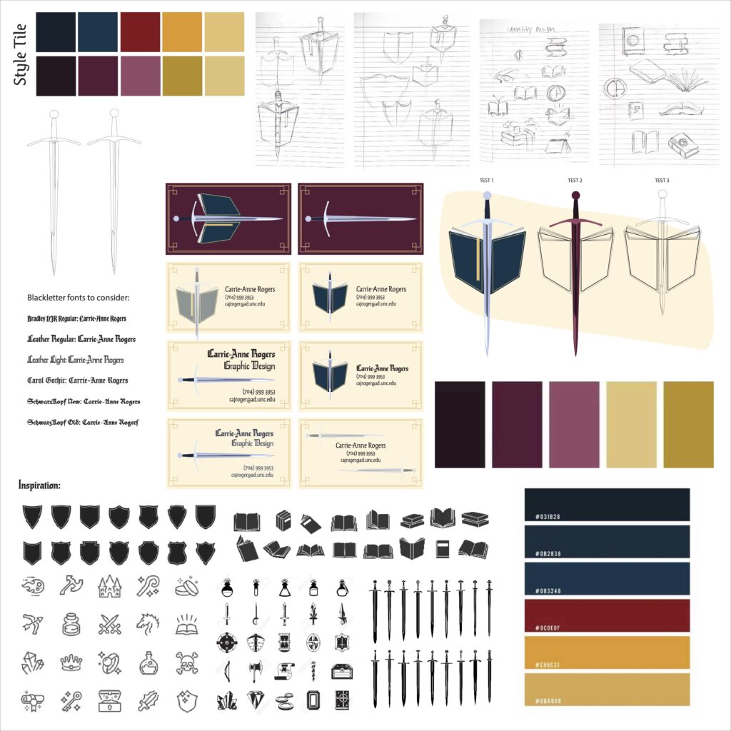
I knew that my logo needed to represent my favorite pastime: reading. When I say I am an avid reader, I mean that my book tally by the end of the year enters the triple-digits. In 2022, I read a total of 140 books; this year, I have read 93 books so far. Beyond my general love of reading, I wanted to represent the fantasy genre. With prominent authors such as George R.R. Martin, Sarah J. Maas, and R.F. Kuang, fantasy books are easily my go-to when picking out a new book. In thinking about iconography representing the genre, I thought of castles, dragons, crowns, magic, and swords. Each of these could have made a fantastic logo, but I felt that the image of a sword was a particularly fitting icon – one that is easy to recognize and tangible. Unlike dragons and magic, swords exist in this world, giving me a strong foundation to start with. The sword is meant to be a longsword, a symbol of power. While there were many positions and angles I could have chosen, I opted for this one as I thought it resembled a shield – another trademark fantasy icon. With the book open, facing away from the viewer, and tilting downward, I wanted to give the suggestion of a shield alongside the sword. The book has notable details, such as the gold embossing, built-in bookmark, and suggestion of pages, that I feel bring it to life. While I did not complicate the embossing on the actual book, I added hints of it as a border for my business card and letterhead, creating unity.
Colors
The background color for most of my project is an off-white parchment color. This was meant to evoke the historical significance and associations of parchment – a medieval writing material.
I also have gold embossing throughout the project, a symbol of wealth and royalty. This once more emphasizes the fantasy aspect of my project, a color associated with crowns as well as decorations on books and weaponry.
Also evoking a sense of royalty is the burgundy, a mixture of red and purple, comprising the background of the back of my business card. It combines the royalty and magic of purple with the passion of red, creating a strong background for my main logo.
My project also features blue – both lighter variations on the sword and a deeper, teal variety on the book. Just as blue is a serene color, books calm me. But blue can also be associated with protection, lending it to the shield-like-nature of the book and the sword.
Typefaces
The first of my typefaces is Leather (Light and Regular), a Blackletter font from Adobe Fonts. It is used for my name as well as my title of Graphic Designer. Being the boldest font in my project, it indicates the importance of the words. I liked the complexity of the font as it reminded me of older texts, but, being so complicated, any use of it needed to be large so that it was still visible. I felt that the combinations of sharp angles and curves mimicked the designs in my logo, creating unity.
The other font I used was Ode (Regular). Like Leather, it is a Blackletter font but not nearly as complex, allowing for greater visibility in longer areas of text.
Intended Message
As I have only recently been interested in graphic design, I opted for a more personal brand rather than one that would represent a company. I wanted this to represent me. The design of my project is an homage to the fantasy books I have loved my entire life. Aside from this, I realized that it also reflected my areas of study at UNC-Chapel Hill. While I am a journalism major, I also study English and the classical humanities, reflecting the book and longsword, respectively.
I feel that the combination of my logo and typeface creates a lasting impression that viewers will remember.